Those screenshots are from game mode, not editor. Finally you can see a quality close to the one on the screen. Anyway I would say that in the scaled screenshots at 1300x800, the 2Kx2K textures are not appreciated at all.
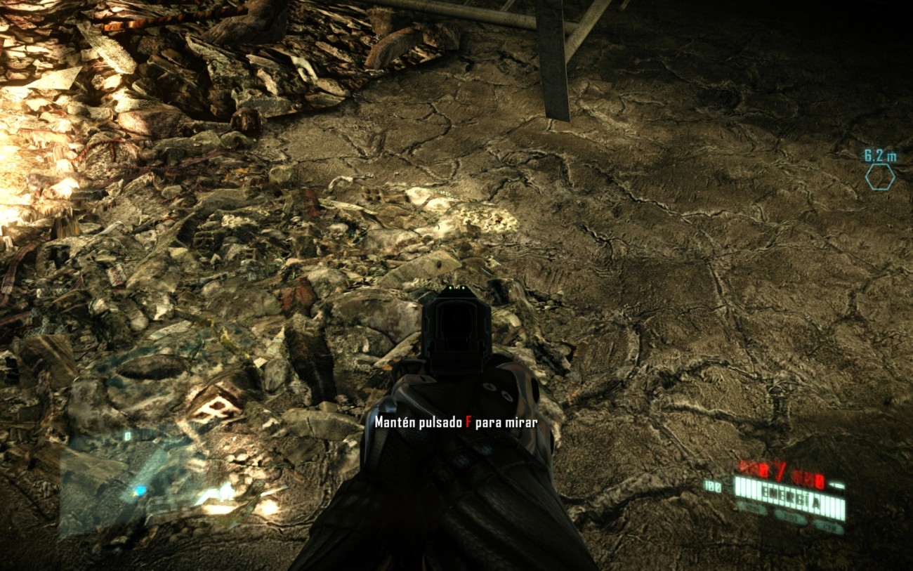
First of all, some of the problems with tesselated concrete in vanilla game. Floating assets, lowres decals, parallax glitches, tesselation not alligned with cracks mask, etc. In my opinion, this concrete floor don't need tesselation, it's not real.


some very good stuff!
ReplyDeletehow long? :)
my new graphic card has arrived...
Amazing ! Looks like real pictures, like real scenes ! Great work :)
ReplyDeleteThis is awesome mate! I am looking forward to release day! ;)
ReplyDeleteKeep up with awesome job!
+1 Release date? :D
ReplyDeleteAmazing job.
amaaaaaaaaaaaaazing
ReplyDeletewhen you gonna upload ur mod boss :)
Oh boy, this is going to be amazing. Truly great work!
ReplyDeleteIf I had one criticism Maldo - and it's very small one!:) - is that the red half of the brick wall need more blend shading like original. For example, images 13,17,37 & 49 look better in terms of colour than the image coming after it (again in terms of colour not texture obviously!).
awesome !! but I feel some textures "too" clean.
ReplyDeletefor example, the number 40 may need some trashes on the ground in the same kind of way of the original
^maaaaaaaaaaaaan shutup with what you feel. gtfo hes done an amazing job so far. its not like you play this game to stare and compare the trash from the original with the new one, unless you got no life at all
ReplyDeleteDude, seriously. Just because he does overall great work and it's free. DOES NOT MEAN IT IS EXEMPT FROM CRITICISM.
DeleteGet that stick out of your ass.
Some of the changes, like the reports on the paper are changed to a medical form. Which is completely inconsistent with the game. Why couldn't he have just replicated the original but in higher resolution?
The bricks in 06-90b look weird. Why does it look like there another like slab of brick that's been cut off, put on top of the other bricks and then cemented there? It doesn't make sense, it looks disconnected unlike "06-90"
The bricks in "49" look more natural than "49b" IMHO Especially when the wall bricks and the beam bricks intersect in the corners. It looks extremely odd on "49b" it doesn't look realistic
There is another issue with "31-11" "31-11b" and "10-89" "10-89b" The door is completely different, which isn't a huge issue(though it does bring to mind "Who would build a segemented door like that?")
The bigger problem is in "10-89b" with the Vent. It looks out of place, just look at the screw on the vent?
By the depiction in this picture, the screw directly goes into the gap between the segments in the door. That doesn't really make sense unless that gap is big enough for a screw to fit and there is actually a hole in there for the screw.
"08-61" "08-61B"
Why did you change the logo?(Somethin to "Stadium somethin") That makes no sense. It looked plenty High res enough. I mean changing the embossed stuff made sense since it was slightly low res.
Default Ultra Visual settings look better. I don't know why you insist on turning them down. BUT, at least you give us the option to turn them back up and that's GREAT. So thanks! It's too bad you can't tweak every single variable CVAR like you can in C1/CWH. Because it would make it easier to have all the Ultra levels of lighting/shadows/Reflections and whatnot but use Gausian DOF instead of BOKEH.
Still, after playing through with the Bokeh, I'm fine with it really. The in game Gunmodels are so fantastically done that it looks great without the DOF in iron sights!
Aside from these minor issues it looks AMAZING.
Unknow quote: "Medical form is inconsistent with the game. Why couldn't he have just replicated the original but in higher resolution?"
DeleteBecause the original is absolutely illegible. Those are the textures of that paper. Take a look
https://lh5.googleusercontent.com/-wSQZrtDVkME/UAUKDc-2GVI/AAAAAAAAANA/C69QKTKx-iM/s1500/paper.jpg
Why do you say a medical form is inconsistent with the game?. There are hazmasuit medics and medical showers and medical tables and medical tools so I think they use that pier building for test or analyze infected people. Maybe the read some medic informs that people have in the medical net and they print those informs.
Unknow quote: "The bricks in 06-90b look weird. Why does it look like there another like slab of brick that's been cut off, put on top of the other bricks and then cemented there? It doesn't make sense, it looks disconnected unlike "06-90"
Please, take a look at 06-90 because original bricks have the same problem. In fact, original bricks has another problem because first and second file are too much alligned and a real brick wall needs some lateral displacement.
Unknow quote: "The bricks in "49" look more natural than "49b" IMHO Especially when the wall bricks and the beam bricks intersect in the corners. It looks extremely odd on "49b" it doesn't look realistic"
I can't understand you. Original screenshots show inconsistent depth bricks because all of them are too long in the two sides of the corner.
Unknow quote: "There is another issue with "31-11" "31-11b" and "10-89" "10-89b" The door is completely different, which isn't a huge issue(though it does bring to mind "Who would build a segemented door like that?")
The bigger problem is in "10-89b" with the Vent. It looks out of place, just look at the screw on the vent?
By the depiction in this picture, the screw directly goes into the gap between the segments in the door. That doesn't really make sense unless that gap is big enough for a screw to fit and there is actually a hole in there for the screw."
The sense is because all of the are real pictures. So, that door exists and I took a photo in the real world. Same for the vent, the holes are like in this picture
http://images04.olx.com.ar/ui/2/74/88/36966688_3.jpg
and the screews are like the model in the middle
http://www.screwfactoryartists.com/wp-content/themes/thesis_15/rotator/screw-graphic.jpg
Sometimes the holes for screws are in the gaps between the segments because that zone is hard enough and avoid deformations of the metal.
Unknow quote: "08-61" "08-61B"
Why did you change the logo?(Somethin to "Stadium somethin") That makes no sense. It looked plenty High res enough. I mean changing the embossed stuff made sense since it was slightly low res."
Because I think original logo is ugly and that sword and shield logo has a very poor design. I used a real logo from real life of a truck company. Maybe that company will be bigger in the future.
Take a look
http://www.internationaltrucks.com/
Mackey seems a typo for Mack trucks imo.
Unknow quote: "Default Ultra Visual settings look better. I don't know why you insist on turning them down."
Because I want play at constant 60 fps.
Unknow quote: "Still, after playing through with the Bokeh, I'm fine with it really. The in game Gunmodels are so fantastically done that it looks great without the DOF in iron sights!"
You can activate bokeh in mod. But bokeh is broken in crysis 2.
naw brah its not about criticism. this is a whole other level of indirect demand here. firstly its his choice what he puts in and how it looks. this is a free mod and he isn't putting a price on it. second of all, the textures being replaced don't have to match the originals. why should they? is the original perfect? no it is not. with all this demand of little shit that doesn't matter, the new version of this mod will never come out. legit like who cares about some screw out of place, some brick thats cut off, some of you guys are seriously unbelivable, you got no life if you notice these things in a video game.
Deletethe amount of detail maldo's new texture pack brings is insane, and its amazing. but seriously criticising such pointless little things is nonsensical
"little shit that doesn't matter" is almost an insult to the level of attention to detail Maldo has exhibited so far, brah ;)
DeleteThis looks so amazing that I'll rather stare at the trash than not play it at all.
ReplyDeleteMALDO para cuando sacás la nueva versión, todavía no jugué el juego esperando que termines, me mata la ansiedad!!! Ya tiene una pinta bárbara el juego, es momento del corte...
ReplyDeleteCriticism is good and Maldo's consideration of all points raised is great.
ReplyDeleteHe shows he has a reason for choosing everything he has and in past experience with the mod (roadrage road as an example) criticism has made him really improve his additions.
There are too many mods where people feel they can't speak up criticise peoples work because of all the hard work the modder has put in.
In any case voicing our opinions is the only thing we can do to help Maldo so why not. Sure he doesn't have to agree or change anything brought up but within reason I don't think any of the suggestions have been particularly negative.
I can agree with the criticism about the vent. It's a very small issue however it does look a little out of place for some reason.
"Unknown" has only given constructive criticism and opinions and on top of that he ended by praising the mod. I hope Maldo sees it the same way.
Which I will also end my little rant on GREAT WORK MALDO!!!
IT LOOKS FREAKING AMAZING!
Thank you. This is entirely 100% true.
DeleteI mean 0. And I MEAN 0 Disrespect. I only want the game and his work to end up the best as it possibly can!
A game like this which already looks so amazing in nearly every category but has low res texturing >:(
People seem to think that whenever someone criticizes free work, or fan work(Which would make sense if he was trying to create a NEW asthetic instead of creating a better version of the original) is out to be running around with a sense of entitlement or whatever. And that SIMPLY isn't true.
(And they probably don't even realize it because they probably aren't creative people , and or are closed minded. Hence the "Get the stick out of your ass" /No offense intended)
As someone who remixes Video game music myself, I encourage people to criticize my work constructively so I can grow and learn from my mistakes and how to better certain aspects. In fact when I first started arranging game music and recording it I submitted it to a monthly competition where Critiques from people on the forum each month in the form of "Reviews" is a crucial part of each Month! If it wasn't for people criticizing me, I don't know how I would've picked up on some stuff without someone pointing it out to me or etc!
And I only mean to do the same here!
Constructive Feedback!
I've already played through the whole game with the old release and it was amazing looking now that it had texturing that was up to par with the rest of the asthetic!
And MaLDo
"Because the original is absolutely illegible. Those are the textures of that paper. Take a look"
While I realize that, let's think for a minute. I bet you that if there was an viral outbreak or whatever on this level(Thousand of people infected and dying or dead), I don't think Medical forms would make sense in terms of trying to contain the outbreak, or get every possible person de-contaminated or cured!
At least seriously not by the time the Level "Battery Park" take place (Which is a long while after the effects of the Ceph start to be seen) and the fact that Battery Park was a EVACUATION CENTER
"The Battery Park Evacuation Center was one of many evacuation centers set up by E.M.A.T. to evacuate civilians to the New York mainland during the Ceph invasion and the Manhattan Virus outbreak."
From: http://crysis.wikia.com/wiki/Battery_Park_Evacuation_Center
So in this context, why would they need medical forms to evacuate possibly infected civilians?
That's right because they wouldn't
(Again, please don't take this the wrong way! I mean this in the most sincere constructive way possible!)
Also at the same time I didn't realize the original texture looked like a medical form, because from the screenshot it looks more like a memo or data sheet containing information based on possible emergency studies or autopsies of deceased victims! (Though you too brought up similar points!)
Honestly though, it s a very minor issue. So no one(myself included)will argue about it. I only wish for the biggest amount of consistency. It's like with plot, no one likes the story in some form of media to be inconsistent or full of plot holes do they? I don't think so.
"Please, take a look at 06-90 because original bricks have the same problem. In fact, original bricks has another problem because first and second file are too much alligned and a real brick wall needs some lateral displacement."
Oh ok, well thank you for clearing that up! It's great that you reply with some solid information. I realize this is Crytek's fault and not your's. And you probably can't do much right?
"I can't understand you. Original screenshots show inconsistent depth bricks because all of them are too long in the two sides of the corner."
DeleteThis is what I was talking about
http://i.minus.com/ibuC7uuIykZDTj.jpg
It just looks kind of odd. If bricks were really intersecting like that shouldn't there be concrete there to hold it together in the gaps rather than them extruding so much?
I've never seen a brick arrangement like that at the corners in real life where it looks like a gap. But that could just be a perspective issue from where the picture was taken?
http://2.bp.blogspot.com/-fPpiAVlTLGY/UAPgesh-RqI/AAAAAAAAAB0/FLqnRYzuAkU/s1300/Crysis2%25202012-07-16%252008-28-57-98.jpg
With this picture it just seems to make sense logically if you look at the fact that the base boards are connected. The original did something similar to your new stuff but it popped out less and just seemed less jarring when you look at it in comparison.
Again, could be cryetk's fault. And is something that is a minor issue!
"The sense is because all of the are real pictures. So, that door exists and I took a photo in the real world. Same for the vent, the holes are like in this picture
http://images04.olx.com.ar/ui/2/74/88/36966688_3.jpg
and the screews are like the model in the middle
http://www.screwfactoryartists.com/wp-content/themes/thesis_15/rotator/screw-graphic.jpg
Sometimes the holes for screws are in the gaps between the segments because that zone is hard enough and avoid deformations of the metal."
Thank you for clearing this up! I was merely curious, because at a glance it seemed just a little odd!
"
Because I think original logo is ugly and that sword and shield logo has a very poor design. I used a real logo from real life of a truck company. Maybe that company will be bigger in the future. "
Well, I guess that's ok. I thought it was fine. It is as Crytek Intended. And it didn't look necessarily out of place in my eyes.
Again, minor issue.
"
DeleteBecause I want play at constant 60 fps."
That's fine! Like I said before, at least you give us the OPTION to CHOOSE!
Personally, 45FPS in C2 looks almost as smooth as 60FPS. When it first came out and I did nothing but play the multiplayer for months and months, while I could achieve up to 70+FPS at max settings. I capped the game at 45FPS so It would never fluctuate and stay smooth. And 45FPS in this was seriously smooth and responsive! Unless playing the single player at a lower framerate causes timing issues with anything. It's nothing but preference. And again, that is fine!
I played the campaign capped at 30FPS. Because a game like Crysis, is obviously cinematic, what with the music, DoF and the way the story is presented you know? So I like games that are cinematic, to look at feel cinematic. 60FPS in games like that just feels too smooth for me. And it really matters on a case by case basis. Not every game and engine copes well with 30FPS vs 60FPS. Like Syndicate, i'd say it's pretty cinematic in some ways. But for plot reasons the controls are slightly sluggish on purpose. And at 30FPS capped on PC, it either feels extremely weird or that I just have to get used to it. Instead I just played the game at 90FPS unlocked, that's where it started to feel like a normal amount of responsiveness.
"You can activate bokeh in mod. But bokeh is broken in crysis 2."
Do you mean it's broken for iron Sights DoF or?
IIRC, Crytek has stated that they deliberately disabled DX11 Bokeh DoF in Iron Sights, saying it is "Too performance costly/heavy"
MaLDo , you do fantastic amazing work. Some of the best texturing i've EVER seen in a retail game, or mod!
Seriously, I don't know why Crytek hasn't called you and offered you a job yet. Because clearly, your chops are very good. And look a ton better than Crytek's own work, which is hilariously shoddy/low quality in every Crysis game.
Seriously CRYTEK! Make a second edition of every game you make, that costs 5$ more and comes with a second or third DVD JUST for Texturing/normal maps/etc!!
IMHO this is probably one of the BIGGEST areas that need to improve for the next gen of consoles. Texturing. We are at a point where they just don't give a shit about Textures, or Anti Aliasing enough to give the options for those with the means to use them, when they improve Image quality just as much if not MORE than all the lighting enhancements and stuff like that. That is becoming the norm for "next gen graphics"
That's not to say that those are bad, quite the opposite. They are great! But damnit! You break the suspension of disbelief if you are trying to do something "Realistic" and then you completely flaw it with the inherent problems of the Digital format (Aliasing/Low Resolution assets). It's really annoying, especially when your eyes have become very acute at analyzing a scene. Something that is near impossible to undo in your brain. It becomes a reflex.
Here is my list for Priority upgrades for the next generation of consoles/computer graphics.
1.Anti-aliasing (Implement all well known methods of each major GPU Brand right into the game for PC versions! On consoles find the absolute best AA setting that will give you near 0 aliasing without any artifacts, but won't rape your performance!)
2.Poly count/body+facial rigging and animation.
3.Texturing
4.Scale and size of the environments and everything.
5.high buffer resolution for stuff like Alpha effects.
@Unknown
DeleteLet me tell you from experience, being able to texture at one's own leisure is a whole 'nother animal than being on a pro team (in my case film/TV vfx). You got dailies, a massive list, critique meetings (sweatbox) all the while doing it at a break-neck pace for 10-15 hours if your in 'Crunch'. What MalDo has done thus far in a multitude of months would probably be hammered down into a 5 or 6 week period. You got to be really good and really fast. For Crysis 2, lower resolution textures were targeted not just because of the console constraints, but also due to the variety needed compared to C1 with probably less dev time. I've seen the personal work of some of the level artists that worked on C2, so really it's not that they're incapable.
Maldo, understandably, does have issues with accuracy towards the source material, and some of the POM maps are 'canned' (ie: run through a filter)...but so were Crytek's in that regard.
How can people critics maldo's work ? The guy who critics many points will never be able to do something so amazing... Every things which has been changed were ugly textures and I agree maldo for all the changes. The criticizer must remind that the mod is a BONUS. If you don't like, don't try it... Maldo takes a lot of his time to do this, he work free because Crysis has a potential to be a great game, maybe the best ! I'm sure that the criticizer will never make a donation. How can you critic a man who work for free, and who make a perfect game on his own ! He alone and he makes an awesome job. So I think critics a not welcome, you should enjoy what you have, the best game whit the best graphics. All the new texture are so photorealistic, before many were ugly, so this is a good change, no reproche can be make... If people want to make reproches, replay the game whitout the mod, you'll remember the difference !
ReplyDeleteWell, thanks again for your great work maldo, keep on this way, and thanks to take on your time to do this, and to answer people who can never do what you've done ;)
^ Calm down man! There is a difference between friendly criticism and what you are saying. No one here has been unhelpful and too critical of Maldo's work. Everyone has said it's amazing so what is your point? Maldo already has listened to healthy criticism before when he changed the asphalt road textures on Road Rage because people spoke up and said it didn't look quite right. Maldo changed it and now looks perfect. Maldo is amazing but I'm sure he prefers to have healthy feedback rather than people kissing his ass all the time!
ReplyDeleteI think that version should be MaLDoHD 4.0 because you changed so many textures and you brought so many improvements not only just small adjustments.
ReplyDeletecriticism are construtive but not the way some are making. It's just think a BIT to understand why some MALDO texture dont match the sytle/visual of the original ones.
ReplyDeleteAnyone here have the crytek HD textures? No!
Take original low res textures to high res? Anyone who ever try make this on a image editor know why. You spent 10x more time and final result are worse than just use another hd textures that you can find/make.
MALDO are modding hundreds textures, imagine if they spent time upconversing all textures or try find/photograph all textures that are compatible with the original! This MOD will be out in 2015!
Of course this is logical. I know MalDo is European, and more than likely doesn't have access to the source material in anything other than bad images and places like CG Textures/Environment-Textures.
DeleteHowever, the hallmark of any great artist is to be flexible and be able to interpret and match an art style. Knowning from past experience (creating a cinematic asset from a low-poly one), there's a ton of color balancing and edits that can be done to make something dis-similar and integrated it into an existing environment. Sure, some of that is an extended learning and tweaking here and there; but it becomes a part of the artist's intuition. Some he's done wonderfully, and other's not so much. However, MalDo's original intention was simply to toss in higher-res textures regardless of if they match the style or not. I've watched MalDo since he's started. At the beginning, I couldn't tell you how many times I cringed at his early work; but he's made incredible strides.
Hola MalDo,
ReplyDeleteCon respecto a las sombras para las hojas en el suelo, pienso que no se ven tan mal después de todo; y menos considerando que normalmente mientras estamos jugando, las hojas sólo las vemos de pasada y no de close-up con zoom... Entonces no puedes hacer que aparezcan más tenues? Sin embargo, sea como sea, creo que incluso así de obscuras, esas pequeñas sombras podrían añadirle un buen efecto de profundidad al suelo de la escena en general.
Quizás podrías ofrecer la opción de activarlas/desactivarlas en el próximo configurador!
Salu2!
Por otro lado, ya conoces los últimos avances en el método SMAA para Anti-Aliasing?
ReplyDeleteParece ser que en algunos casos puede llegar a producir un efecto de mucha mayor calidad que el FXAA. Y lo mejor, es que también se trata de un excelente trabajo por parte de colegas españoles... Si no lo conoces, estaría muy bien que le des una revisada a esto:
http://www.iryoku.com/smaa/
Además de la presentación y el vídeo, el "precompiled demo" que ofrecen disponible para bajar, es perfecto para que te des una idea de su funcionamiento en tiempo real, así como de sus posibilidades y ventajas frente al FXAA... Pero en fin, si tienes tiempo revísalo todo ;)
Estaría genial que encontraras la manera de implementarlo en tu próximo paquete! :D
Y otra opción, sería poder utilizar el FXAA del nVidia Control Panel, el cual no tiene efecto en tu mod, aún cuando tu configurador desactivemos totalmente las opciones de AA disponibles (y es superior "FXAA Post Process Injector" que funciona como parche para cualquier juego con tan solo ponerlo en las carpetas en donde se encuentran los archivos binarios).
Muchas felicitaciones por el increíble trabajo que estás haciendo; no solo para los fans de Crysis-Crytek, sino más aún para tus propios fans, que te aseguro ya somos montones de agradecidos.
Suerte!
Αντε ρε φιλαρακι μας γκαστρωσες! Πότε θα το βγαλεις; τουλαχιστον μαλάκα μην λες ψέματα ότι είσαι στο 99,2% ουτε την πρώτη πίστα δεν έχεις φτιάξει. Βλάκα ε βλάκα... αχρηστε!
ReplyDeleteOkay first of all, Maldo, did you ever upload the 3.0c version?
ReplyDeleteI'm confused because some videos on youtube say 3.0c, but I can't seem to find 3.0c anywhere. I've got my hands on a 3.0b version.
And if you could optimize the vram usage a little for us with 1Gb Vram & 1080p it would be great ^^
I've already turned off the crytek HD pack because I fail to see any significant differences.
But then using Dx11 is also not good because your fix introduces huge tessellation fixes as well. (the railway tracks and station platforms especially)
And if possible please include C-Mod as well as Quality Mod v1.91 in your 3.0c when you release it if possible :)
Last of all, great job! Got back in crysis 2 avoiding crysis 1 just because of your textures and well stealth enhance :D
3.0c is not here yet ;)
ReplyDeleteThe only thing I would like to criticize MaLDo is why did you choose to leave in those sh***y flat bullet shells found scattered throughout the game.. That and the flat bottles in the floating water garbage is what seriously annoyed me the most in this game. Wtf were crytek thinking seriously??
ReplyDeleteThey really dropped the ball in Crysis 2 in a lot of ways visually MaLDo.. I'm just glad you're willing to pick up the pieces mate. Superb work
Gostaria de saber quando teremos a Versão 3c pois está demorando muito. Tem quase 1 ano.
ReplyDelete"The only thing I would like to criticize MaLDo is why did you choose to leave in those sh***y flat bullet shells found scattered throughout the game.."
ReplyDeleteI agree, bullets on the floor look pretty bad.
They just need proper shadowing, lol. They lack any sort of shadows, which is why they look terrible.
DeleteUmm.. No. They need actual geometry. What year are we living in 1998?? Those bullet shells could easily be turned into basic low poly primitives and they'd look 10x better
DeleteEverything in a game is generally low-poly. I think it would be better to have a mix. the decal is great for general cover, but a few pieces of geometry..especialy near the 'front' will bring it home. Remember, the whole purpose of game graphics is to fool the eye.
DeleteThe current version of MaLDo HD is amazing, and the fact that MaLDO is putting forward so much time to make it even better really commands respect.
ReplyDeleteI made a quick vid to showoff MaLDo HD v.3.0 and Blackfire Mod 2 which is integrated really well with this mod. These two together really make Crysis 2 look like a completely different game.
http://youtu.be/YI4cqE_U_aM
Great job MaLDo, hope you work your magic on Crysis 3 :)
This man is crazy some one need to stop him :)
ReplyDeletejust bought a new graphic card. i never played often video games. But this time i decided to play one, cause i saw these amazing vids with maldo and blackfire, shone quality mod.
ReplyDeletei installed all. there is almost no video on youtube, which showed off this amazing quality.Especially Broadway Map and the ones which follow. Crazy!!!!!!
The the pic showing a "N.Y.C. City Sewer"-cover with an additional "Made in China"-hint ... pretty funny man ;)
ReplyDeleteHi Maldo, first of all I want to thank you for sharing your amazing work with us. You rock dude.
ReplyDeleteI need help though, I installed your mod but it really messes up my game, the geometry is all wrong and smoke and fire are made out of pixels the size of buildings lol.
Any idea what I'm doing wrong?
This mod is really shaping up to be great,looking forward to the release very much,but I do have a question:
ReplyDeletehttp://www.youtube.com/watch?feature=player_detailpage&v=YI4cqE_U_aM#t=304s
In this video,there are some slightly distracting graphical anomalies,that I experienced too.I would like to ask,will they be fixed in 3.0c version?
in regards to the configuration Utility for 3.0 Crysis 2 last completed one i was wondering ...what does each slider have to be at to max the game out to full maximum graphics. maybe i can email you a screen shot of what i have as settings to be sure it is maxed.Reason i ask is all though i believe i have it all maxed in your utility it shows extreme in game in the graphics settings.Just want to be sure i am at ultra and better with your set up . Thanks Gary~
ReplyDeleteYou can max it in the maldo config tool and it doesn't matter what comes up in your ingame settings list, or set "use ingame settings" in the maldo tool and then the settings in the menu are what is used.
DeleteOK i maxed the utility out
ReplyDeleteAnti aliasing - FXAA High No jaggies....
LOD - 23
View Distance - 10 extreme/ultra value
Shadow Blur - 0.75 (like crisp shadow detail)
Depth of - Cinema
Global Preset - un-check and set to Ultra
water tessellation - checked
level/objects tessellation - normal
Parallax Mapping - checked
real time reflections - checked
SSDO - checked
Particle shadows un-checked
reduced grain filter - checked
and last but not least skip intro checked as well but that does nothing for fps.
.Ignoring the "extreme" showing in the in game settings.
Y U NO USE CRYENGINE'S PRETTY SHADOWS?!?!?!
DeleteNOPE !...don't like em dull and fuzzy...;p. Maldo shadows for the extreme hands down win indeed. Heck for that matter Maldo everything for the win .Total game changer with his mod hands down.
DeleteEach to their own. I'll stick with the dynamic penumbra shadows.
DeleteThe keyhole for
ReplyDeletehttp://1.bp.blogspot.com/--pZ4mpY4eWg/UAPgy9poIdI/AAAAAAAAAGI/NMbEtxbKIoY/s320/Crysis2%25202012-07-16%252008-36-31-11b.jpg
Is WAY too small.
And I'll be honest, as funny as it is, I rather not have that "Made in China" sewer. Bit of an immersion breaker.
Out of context?
Deletehttp://upload.wikimedia.org/wikipedia/commons/8/8d/NYC-sewer-made-in-China.jpg
http://senseslost.com/third-rail-content/uploads/nyc-manhole.jpg
I think original keyhole is way too big for a key in 2030. Bigger than a nanosuit finger.
Really guys, would you stop complaining about stupid things that no one will ever notice (the size of the keyhole in the door, what's written on the medical document, what kind of screws does the door use...) and let MaLDo do his job?
ReplyDeleteIf you want to criticize something, at least speak about something more important (like we did for the big asphalt texture in FDR road, ok, that was right...), but don't make him waste time with these little details :)
Great work as always, MaLDo ;)
Here,I have something important to suggest:
Deletehttp://www.youtube.com/watch?feature=player_detailpage&v=YI4cqE_U_aM#t=304s
Will the missing textures shown in this video be fixed?
Other than that,I see no problems,and have nothing to add.I'll just say,great work,MALDO!
^ Exactly, people are getting a little ridiculous with their 'suggestions' now!!
ReplyDeletefor the love of god everyone stfu with the stupid suggestions. you ppl srs have no lives. just let him do whatever he wants, its free anyway. maaaan u guys are unbelivable
ReplyDeleteYou sir have obviously never have taken part in anything creative. Or created anything yourself. Because if you did, you'd know there is such a thing as "Constructive Criticism"
Deletehttp://www.wisegeek.com/what-is-constructive-criticism.htm
^Whether or not I agree with your point, your language and attitude is disgusting and I'm sure you have ruined many good conversations with your terrible social skills. Grow up and learn to be more diplomatic and mature with your words otherwise don't join in conversations with normal people. Maldo should delete your post as it brings the quality of his blog down.
ReplyDelete....Anyways, WHO IS SUPER PSYCHED FOR NEW MALDO CRYSIS???!?!?!?!?!?! YEAHHHHHHHH!!!!!!!?!?!?!?! I haven't played the game in forever and still haven't finished it (NO SPOILERS!) keeeeen as!
ReplyDeleteI am graphics whore.
I am excite.
I am excite as well.
ReplyDeleteMaldo, great job on this level - you have outdone yourself. I love the new tank tracks - those never looked right to me. You are a master with POM, as well. Can't wait for release!
I do agree that we at least need the option for DX11 shadows with variable penumbra - they really add to the immersion for me, and really don't have much of a performance hit.
Keep up the great work!!!
Damn good job bro!, i cant wait to get the finished design.
ReplyDelete